We’d collaborate with in-house engineers and product leaders to transform their most important legacy product — a customer chat platform — into an omnichannel portal of empowerment for customer service agents.
An intuitive interface that keeps the customer front and center
All UX design is a series of micro-decisions that, when put together, create a logical, scalable system. Our challenge was to make those decisions accommodate a truly incredible volume of legacy features and capabilities within this platform’s chat and email tools.
The support agents who use the platform are simultaneously corresponding with dozens of customers across multiple channels, tagging and annotating sessions, looking up customer details and previous transcripts, researching support questions, transferring to other queues, tracking their productivity, and more — in total, we logged hundreds of possible actions one of these super users might perform on the job. On top of that, the UI had to accommodate a wide range of customizable features deployed to sales and service teams of various sizes, configurations, and industries.
The stakeholder team likes to move fast and meet the unique needs of their customers — but over time, that kind of environment can lead to lots of one-off design decisions and an unwieldy feature set. We needed a consistent guiding principle to keep one-offs at bay. The platform is all about empowering their clients to deliver exceptional customer service, and that became our design mantra as well. Our One Rule to rule them all: put the end-customer first.
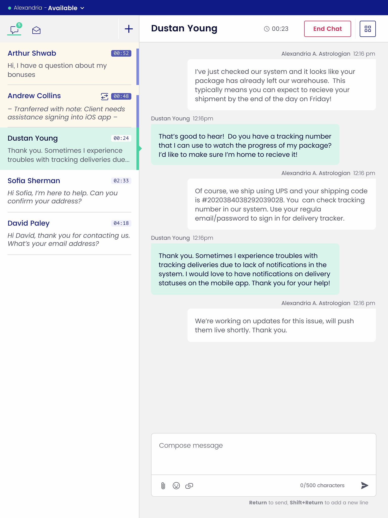
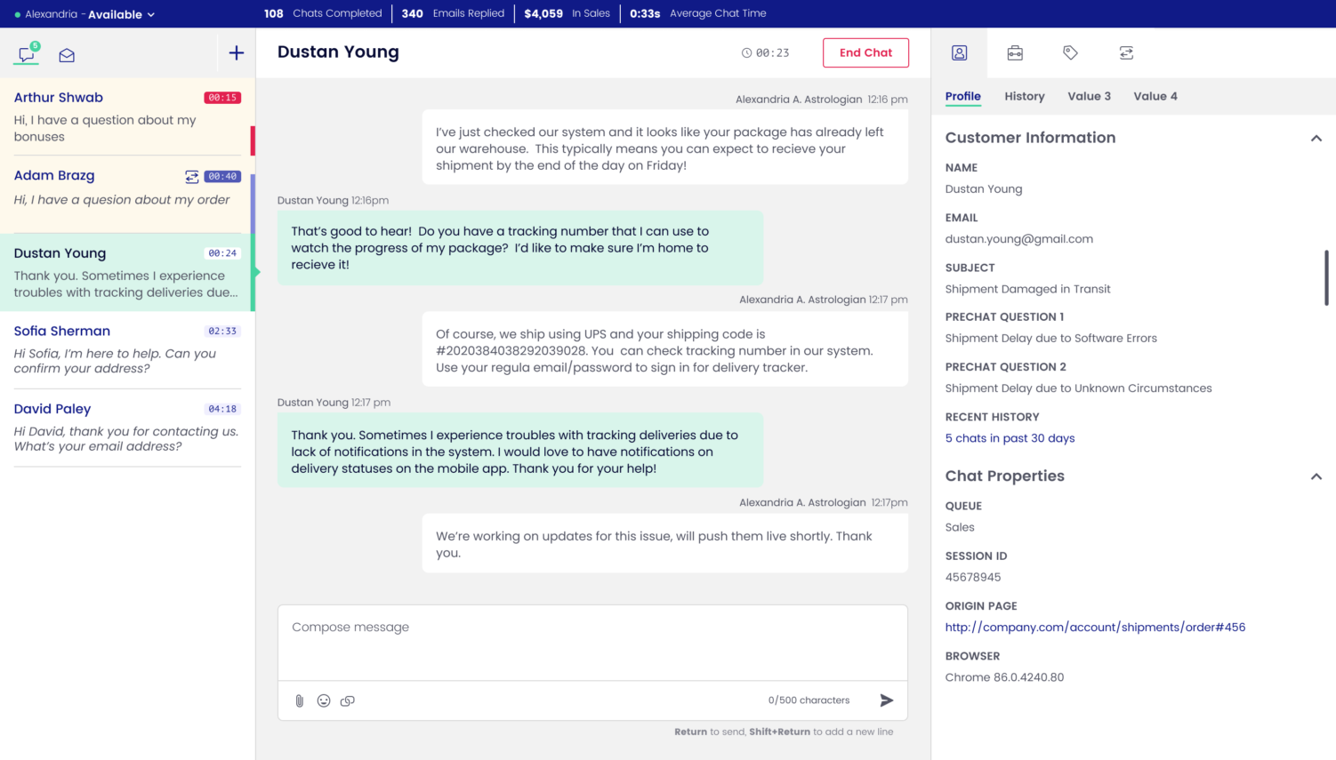
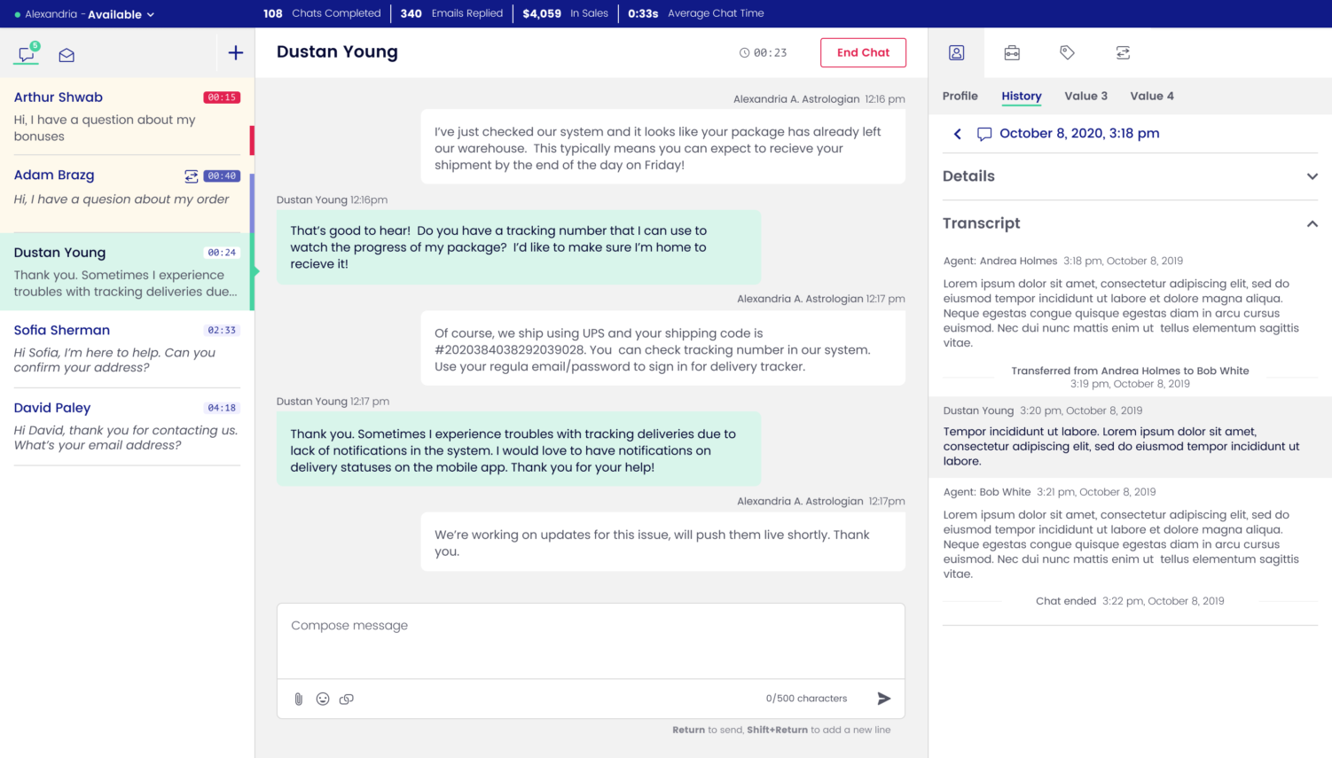
You can see that One Rule come to life in small moments, like how the customer name is the only element on an agent’s screen that uses that font and styling. More significantly, that One Rule keeps the agent’s chat queue and customer conversation in view at all times.
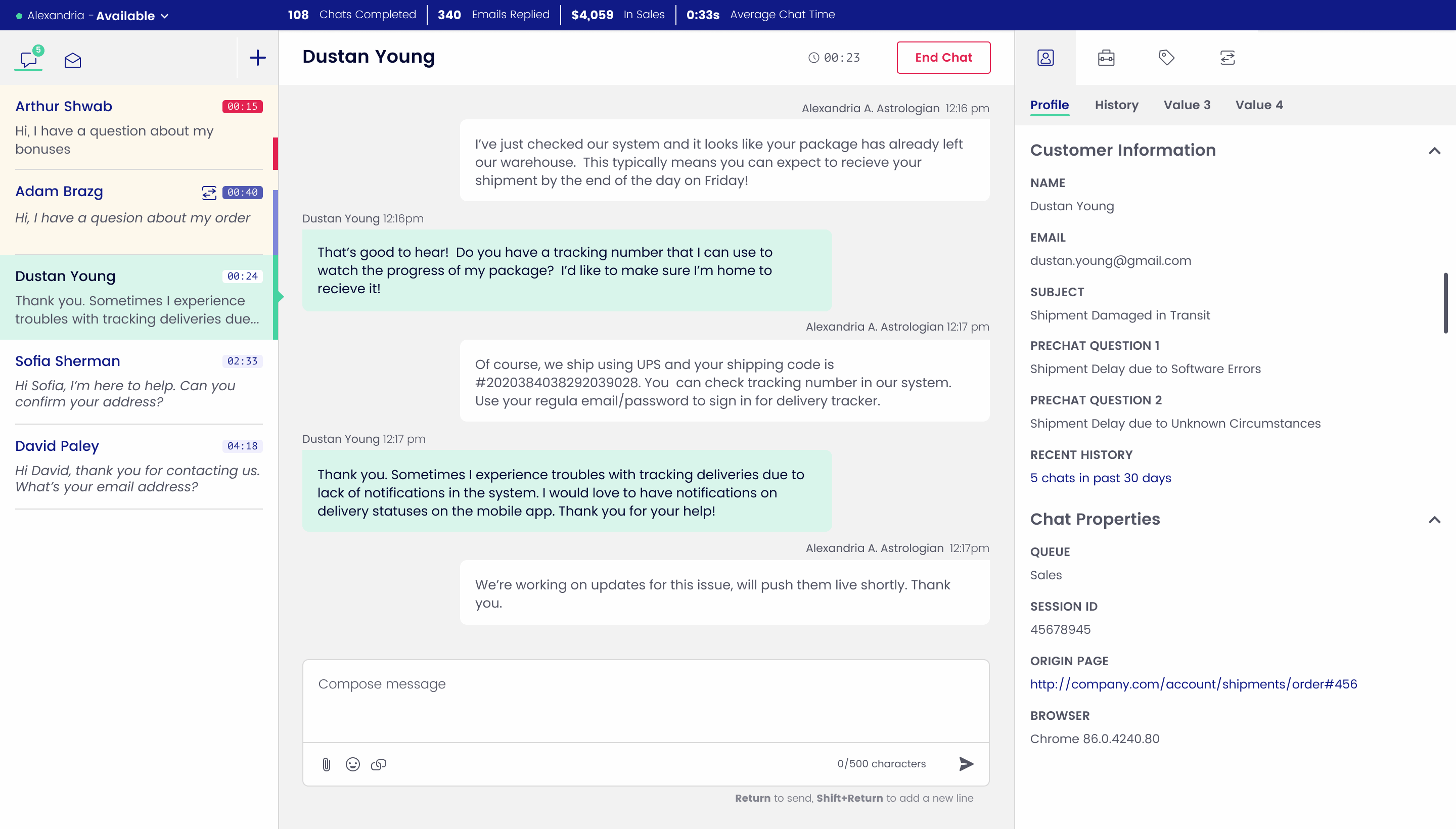
Reserving the left and center panels absolutely made our job harder. Anything outside of the queue and conversation automatically had to live in the right panel, which is a pretty skinny space to display information. Take transcripts: if an agent wants to review prior chats with their customer, it would be easy to just show the transcript in the center panel, similar to how you can read old text messages with your friends. But that would create risk for the support agent to lose track of the current conversation. It de-prioritizes the customer — which means transcripts needed to stay to the right.
Design logic that meets the needs of valuable edge-case clients
In most product overhauls, it’s best to design for the majority of users, and just try to make it as painless as possible for the few edge cases to get by — a sort of 80:20 rule that reduces bloat, increases efficiency, and ensures the product works extremely well for most people. It wasn’t so simple in this case. This chat tool had been so important to so many major clients for such a long time, edge cases we would have ignored on another product became a fundamental part of our decision-making process.
A perfect example is nesting. The chat tool was originally built with very few product limitations. When a customer conversation ends, the agent tags it so it gets filed away in the correct category — and there were historically no rules for how those tags (or “dispositions”) worked. No character limits, no limits to how many folders and subfolders one category could contain, no limit to how many folder levels deep, no limit to how many tags can be applied to one conversation. As we designed the new interface, we needed to create a UI that accommodated all of these edge cases within the limited horizontal real estate of the right panel, with a fast-moving, power user in mind.
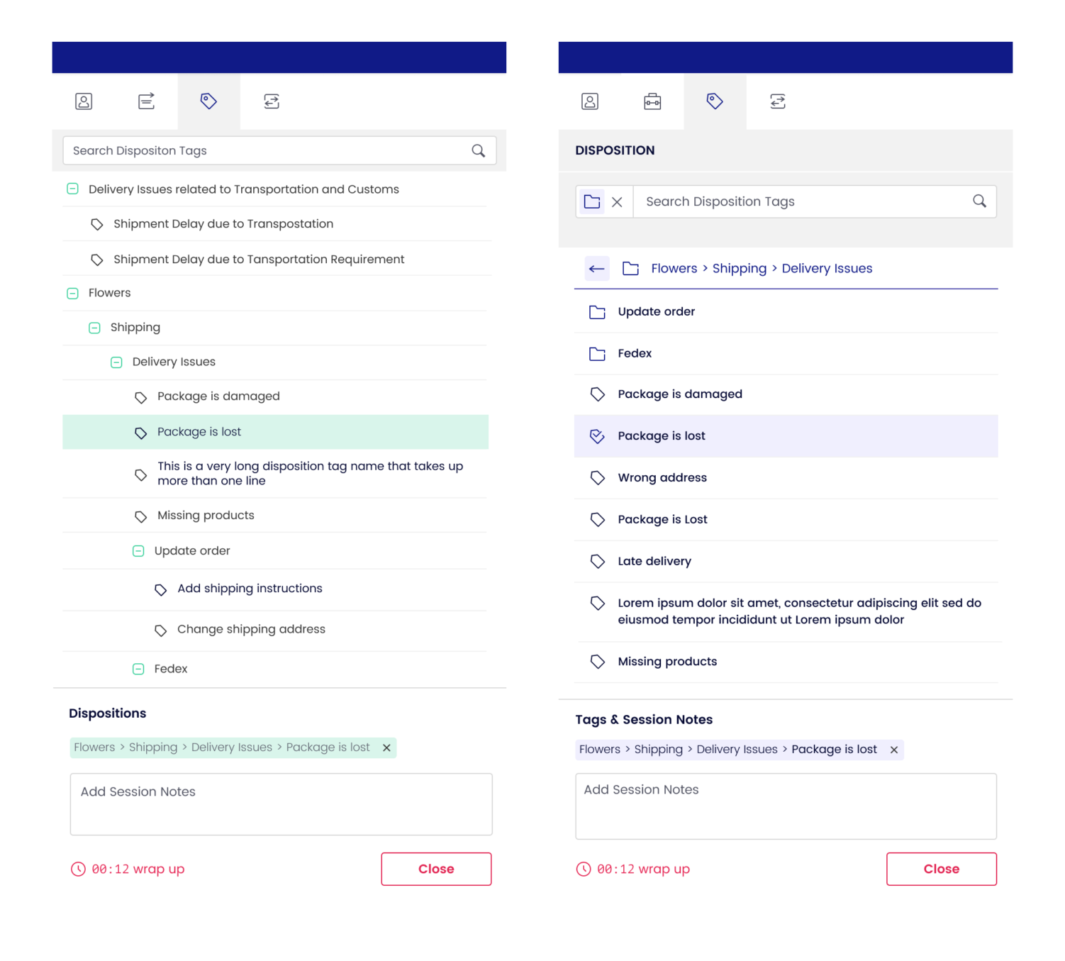
The first decision we needed to make was: folder system vs tree structure? A tree makes sense. Being able to see content from multiple folders at once is useful. But it only works if every tree was only three folders deep, with no more than one line of characters for each tag label. Anything more, and the tree becomes unwieldy, and it becomes challenging to find your way back to the root. (Remember, we’re in right panel territory.)
Because we were using real data sets to evaluate the usability of our designs, we realized fast that lots of organizations using the chat exceeded those limits. Ultimately we decided on a folder system — intuitive and beautiful, and a design that would actually work for the longtime user base. This also created a foundation for other features that similarly suffer from a lack of constraints.
Bilberrry was always able to see three moves ahead. Their attention to detail on how every decision would impact the final product kept the entire engagement on-track and organized.
SENIOR DIRECTOR of PRODUCT MANAGEMENT
Collaboration with in-house developers to ensure a frictionless beta launch
Understanding implementation matters. It’s one of our UX superpowers, and it comes from our origin story: Bilberrry started as a development agency. Our designers can’t design without also thinking about the conversation they’ll have to have with our engineers sitting three desks away — or in this case, the client’s in-house engineering team.
It doesn’t matter how beautiful a design is: if it’s a pain to implement, it’s not going live (at least, not on time). It’s a constant negotiation of where to allocate engineering resources, between perfecting a few features vs getting more features out faster. It’s why we collaborated with engineering throughout the entire design process, as well as into development.
This close-knit relationship helped shape our design decisions, especially when it came to responsive design. As you well know by now, the agent’s queue and conversation were the priority, which meant our trusty right panel would have to collapse on smaller screens. An initial idea we had to access that panel was a floating menu that would expand as a drawer — it looked slick, closely followed the full-screen design, and key stakeholders loved it.
But the front-end devs did not: floating drawers would be a net-new component, and add to both build time and ongoing maintenance. We agreed the complexity wasn’t worth it. Our final design was a classic hamburger menu: simple to create and still gave users a great experience.