A website is a lot like a garage. It’s not a very glamorous metaphor, but it’s apt: websites are big, useful spaces we access every day — and they also have a lot of overstuffed nooks and crannies we’d rather pretend aren’t there. A lot of website redesigns come our way because those nooks and crannies are no longer avoidable. Users can’t find what they’re looking for, and our clients are frustrated managing their content. Basically: the car can’t get into the garage anymore.
This is totally normal. It’s the nature of any thriving website. We just need to reorganize — a process that centers around the site navigation.
This always starts with some sort of discovery conversation where we ask questions like: Who’s this site for? What do they need to do here and how can we make that easier? These questions are centered around audiences, but we don’t typically reorganize with an audience-based navigation. Instead, we prioritize tasks — and here’s why.
First, a quick overview of audience-based navigation
A website structured with audience-based navigation presents different features of the site to different target audiences. You know you’re on a site with this type of organization when you’re asked to select the audience you belong to.
This is very common on banking websites, which will guide you toward Personal, Business, or Corporate categories. Schools and universities also do this for Prospective Students, Current Students, Faculty, Staff, etc. Even the IRS has audience-based navigation for Nonprofits and Tax Pros. In its finest application, audience-based navigation helps users focus on what is relevant and important to them by surfacing that content and hiding what doesn’t apply.
There are two mail reasons why an audience-based navigation might fail
1. It’s really hard to create mutually exclusive categories
On the vast majority of websites, most of the content is relevant to most people. Mutually exclusive content isn’t that common, even though it often feels that way when we’re creating it. For example, if I have a goal to target teachers on my website, and build out a whole content program with teachers in mind, it makes total sense to label that content “Teachers.”
But let’s take a look at one of our website redesign clients, the Washington Apple Commission. Here’s the navigation they were using when they came to Bilberrry:
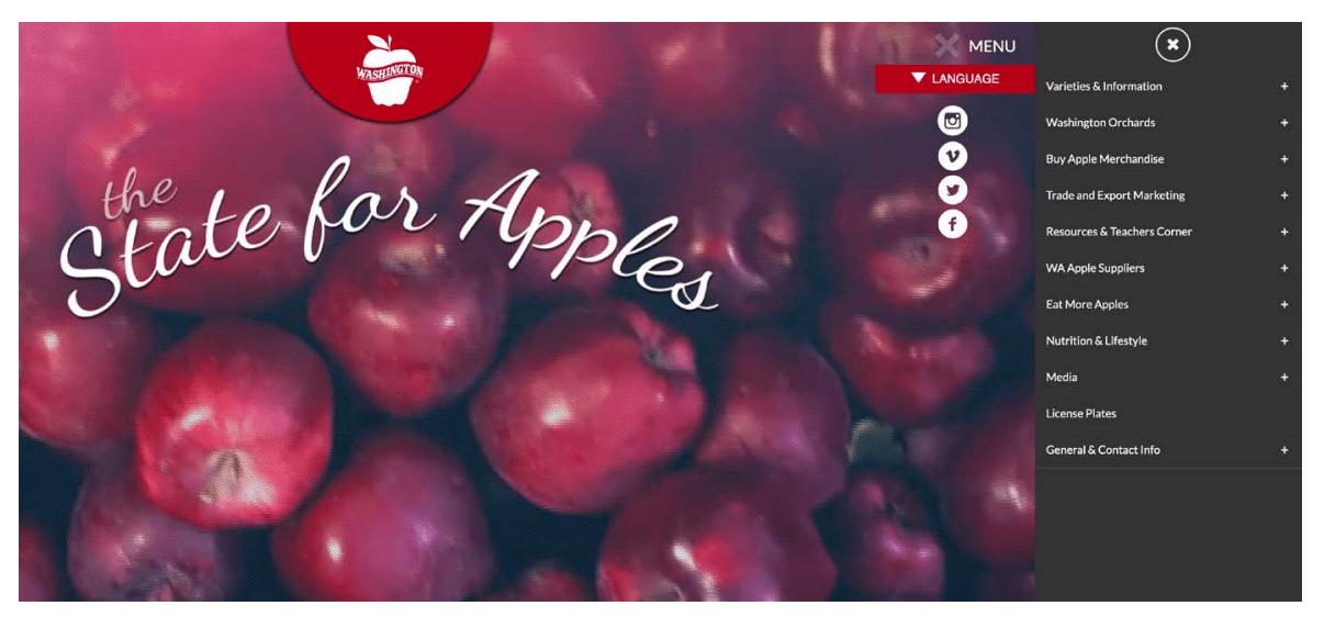
The navigation design looks simple but the user experience wasn’t — you need to know if you’re a consumer, a teacher, or a supplier, and then guess where the content you’re interested might live. This is gets even more complicated when you need to choose among overlapping categories. We bet most teachers are also consumers of apples.
Say our apple-eating teacher is trying to figure out how to keep apples from browning. Is the information in Varieties & Information or Resources & Teacher’s Corner or Eat More Apples? It could really fit all three — which leaves them bopping around from section to section. At the same time, the content manager for the site is potentially adding the same information to three different parts of the site. Not great.
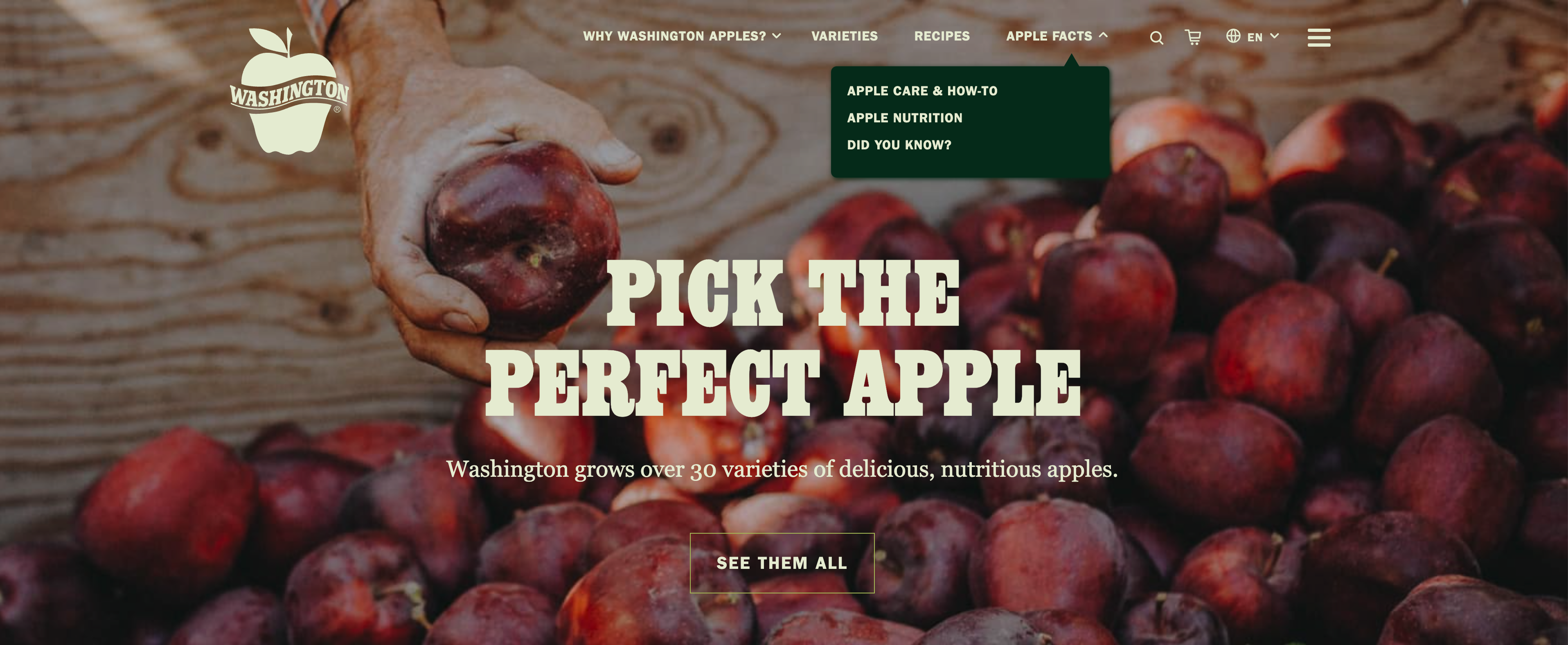
Our updated navigation streamlines it all.
2. Self-selecting an audience adds to the cognitive load
Who are you? is a simple sounding question that takes a surprising amount of brain power to answer. That added brain power could harm the user experience — it can introduce negative feelings like frustration, confusion, and mistrust.
A few common confusions and hesitations of audience-based navigation:
- Is the label about that group or for that group?
- Does another group have better options or better prices?
- But, I’m in more than one audience…
- Which answer do I think will get me the information I’m after?
We’ve all been there. The easiest way for someone to remedy negative feelings? X out of the site.
How we implement task-based organization
Focus on tasks
Web users are task-oriented: they come to a website with a goal in mind. Information organized by topic or by frequent tasks is often easier to navigate because it immediately addresses what people seek. People aren’t asking, Who am I? They’re asking, How can I pay my bill?
Use nouns, not verbs
Just like web users are task oriented, people’s brains think in terms of nouns, not verbs. When you get up in the morning, you think: coffee, breakfast — not brew, cook. Nouns, or objects, are more specific and concrete. It’s not brewing that’s important, it’s the coffee.
This is also called “object-oriented” or “object-focused” thinking. It’s why instead of using verbs like Schedule or Book as menu options, most successful task-oriented websites use nouns like Calendar, Flights, Hotels, or Deals. (We don’t throw out verbs altogether — they are great for call to action buttons, and on occasion work just fine in the nav.)
If you’re really jamming on this, there’s a ton of cool information out there about object-oriented navigation and design, and how the brain works in these ways. We recommend Why Verbs are Hard to Learn and Object-Focused vs Task-Focused Design.
Default to the most common audience, and make it easy to switch
We’re not task-based hardliners. Some sites truly do have unique use cases and distinct content for each group. We generally recommend defaulting to the most common audience, and making it easy to switch. Airbnb does a great job of this. Their first question isn’t: Are you a guest or a host? It assumes you’re a guest who is looking for a place to stay or an experience. Most importantly: Switching is easy — in the top right corner is the option to Become a Host.
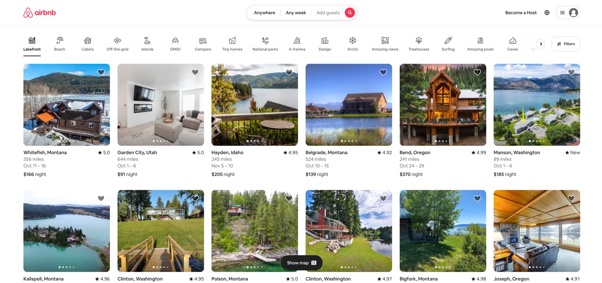
We love this solution, especially because there are such distinct differences in the resources each group needs. We imagine that Airbnb hosts need to manage their listing; as a guest you want to browse and book all the listings.
You can also make audience-based navigation work by using it as a secondary or tertiary organizational structure, and making sure you are creating clear, mutually exclusive audience types. We know, we know: easier said than done.
Our POV: We start with audience discovery, then focus on tasks
We want our sites to be easy to use. Sorting the site into content made specifically for different users — or with an audience-based navigation — seems like it would give them that tailored experience. In reality, it makes it more challenging to use, and harder to manage on the back end. That’s why we typically end up using task-based navigation and/or object-focused design. We ask, “What do our users need to do?” then we make it as fast as possible to execute.