In six months, we’d completely restructure the way CCHP’s mammoth library of policy content was stored, updated, and displayed, making it easier for the CCHP team to manage and more accessible for their users. At the same time, we’d finesse the site’s organization, messaging, and design to help newcomers understand and orient themselves in such a complicated space.
A relational database to house a huge volume of policy data
CCHP tracks and documents an encyclopedic amount of policy data. Currently, there are 28 unique topics under 4 regulatory categories that are all continuously researched and updated across 52 jurisdictions — that’s 1,300(!) pieces of content, which can range anywhere from a few sentences to many paragraphs. Previously, CCHP had the data housed in one long nested list — you could filter and jump to a specific jurisdiction or policy topic, but the experience was crowded and unwieldy to navigate.
Our first move was to adapt that long-scrolling library into a relational database, breaking out the policies into individual units of content and a set list of attributes: jurisdiction, policy category, policy topic, last updated date, revision draft status, assigned analyst, whether or not the policy should appear on an individual map, and so on. Now CCHP analysts can manage their policy review workflows and growing database directly in the website backend, and we are able to spin up a bunch of different ways to view the content on the front end.
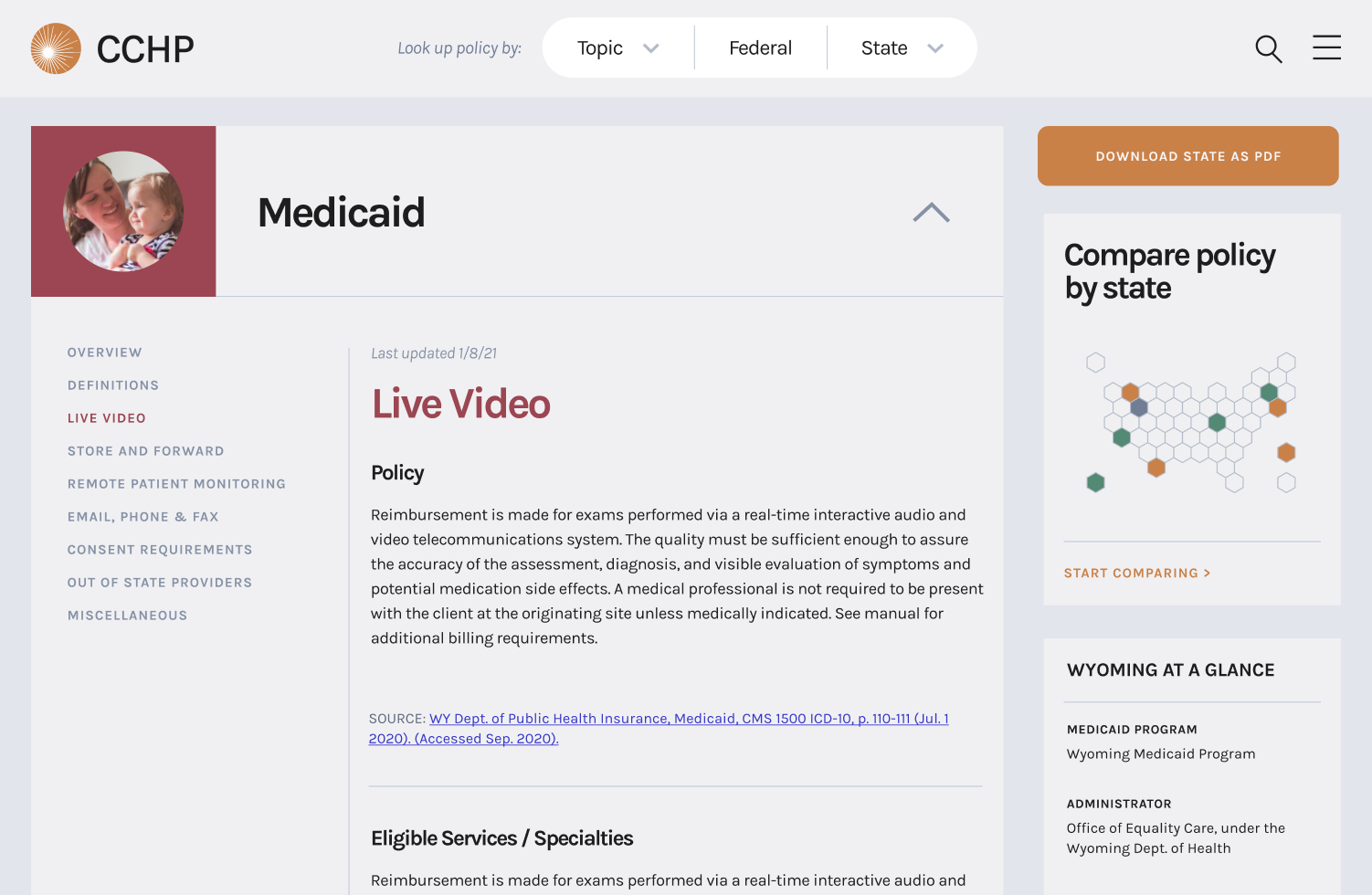
Viewing all the policies for a single state got a lot more breathing room:
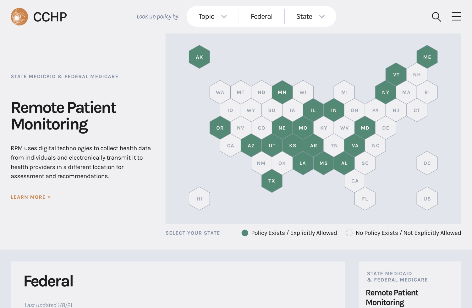
As did skimming through a single topic:
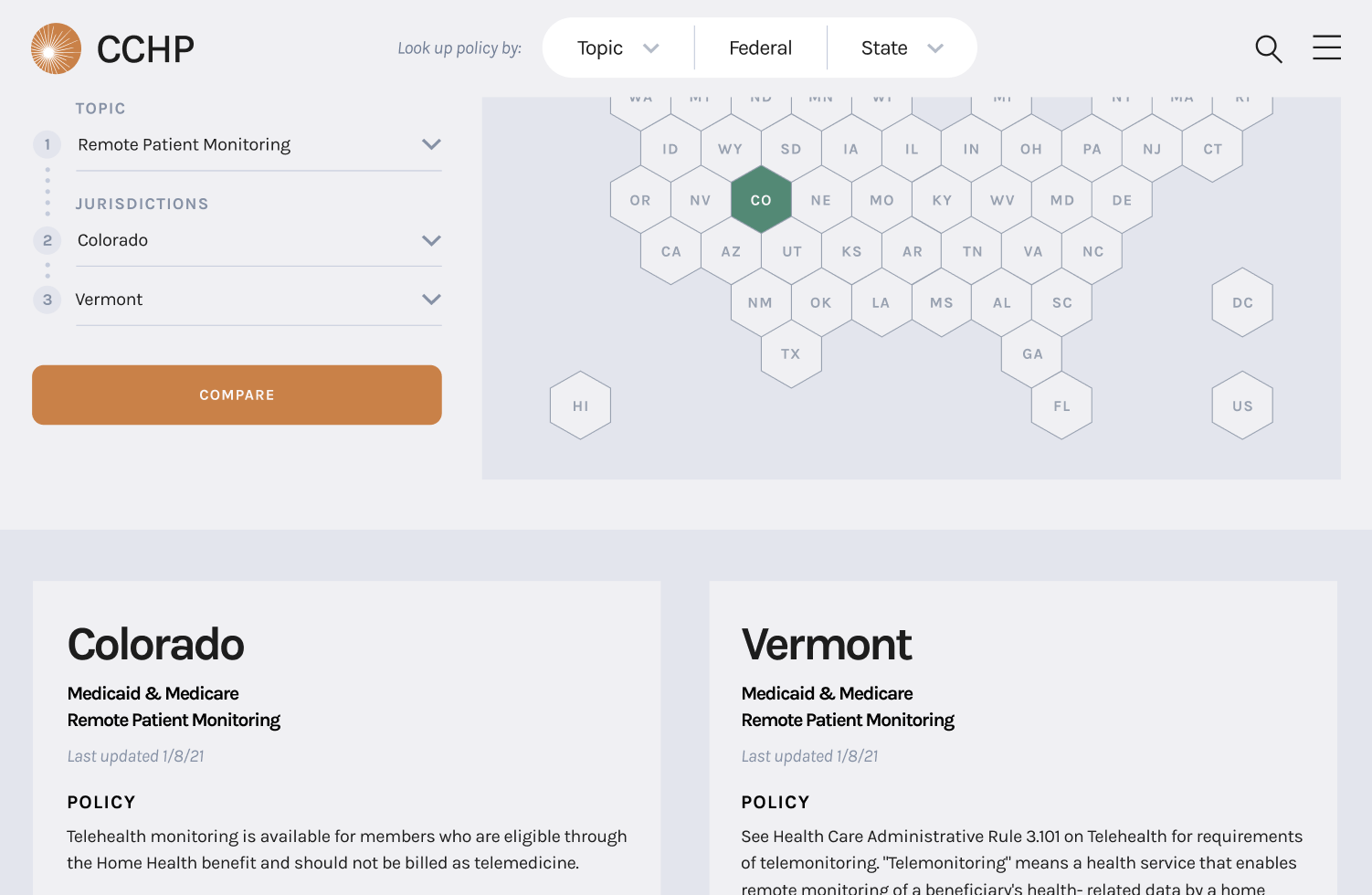
And you’re also now able to quickly see how two states compare side-by-side:
Using a database model also made keeping the information accurate across the entire site a lot easier. Rather than having to remember every page a certain policy was referenced — and then going through and updating each instance as necessary — the CCHP team now only needs to update a policy in one spot in the backend. That update is reflected anywhere the data is being displayed on the site.
Entry-level About info and explainers for a new and growing audience
CCHP struggled communicating what they called their “multiple identities.” Like many not-for-profit agencies, they play different roles in their field and are associated with a slew of organizational bodies: CCHP is a program of the Public Health Institute; they also are the federally designated National Telehealth Policy Resource Center, which is funded by HRSA, and acts as the administering entity of the National Consortium of Telehealth Resource Centers. Meanwhile, in their home state, they head up the California Telehealth Policy Coalition.
All of these identities (and corresponding acronyms) needed real estate on the new site. They also required cogent explanations that helped anyone new to CCHP understand their authority and influence in the space — basically, we wanted people to know at a glance that, if they’re looking for anything about telehealth policy, they’re in the right place.
Being an outsider was a huge benefit in accomplishing this. We had the CCHP team talk us through their various identities. Then we had them do it again, only faster. That entry-level explainer became the outline for CCHP’s new How We Work page, which uses a two-column design to anchor the eye on their main identity statements, and acts as the jumping off point to content deeper in the site.
Being new to telehealth also gave us great insight into how other newcomers would feel landing on the site. Telehealth policy is sprawling and complicated — every state defines it differently, uses it differently, and regulates it differently. CCHP has a huge amount of content detailing those differences and how to navigate them, but it can feel like drinking out of a fire hose if you don’t know where to orient yourself.
We approached the new site design and information organization with two types of audiences in mind: policy pros who know exactly what they’re looking for, and first-timers who maybe aren’t even sure what telemedicine is. Both have easy entry points into CCHP’s content. Anyone familiar with how telehealth policy is structured can look up a topic or jurisdiction from the search bar at the top of every page, or access the Policy Finder database from the homepage or hamburger menu. We also carved out a dedicated “Understanding telehealth policy” space for newcomers to walk through the broad strokes of telehealth, how policy is structured in the US, and where to get more specific questions answered. The results are a tighter and more accessible website that can meet the needs of a wide and varied audience.
A CMS custom-designed for a unique revision and review process
CMS stands for content management system. But when you have a robust, multi-stage process to manage your content — like CCHP does — your CMS is often limited to simply a publishing platform, with the underlying process and redlining taking place across a hodgepodge of tools, like Word Docs and spreadsheets and emailed file folders. Sound familiar?
Our goal was to design CCHP’s new WordPress admin panel to truly manage CCHP’s content from beginning to end. For one thing, it would be more efficient. Rather than keeping track of multiple files and systems, everything would live in one central source of truth where the whole team has visibility and can collaborate.
Another big benefit for updating the process out of Word Docs and tracked changes is reducing loss of data. One of CCHP’s superpowers is their understanding of the way the policy landscape has changed over time. Unfortunately, their process wasn’t optimized to help them capture those changes in a structured data: once a tracked change was accepted, it wasn’t easy to go back and pull previous versions. The new CMS not only saves that revision history and makes it easily accessible, it creates opportunities for potential future experiences that showcase how policies and jurisdictions have evolved.